Magazine
issues
I designed multiple spreads for renowned magazines, making sure each one matched the style of the publication. This included designing shopping lists and working on photography to make the layouts stand out.

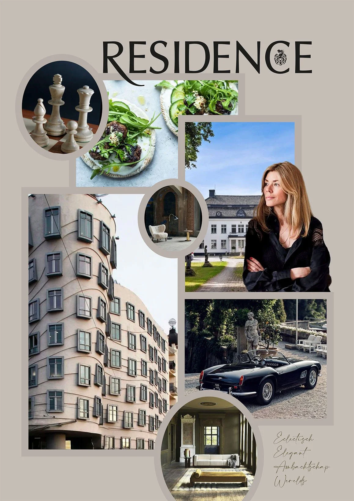

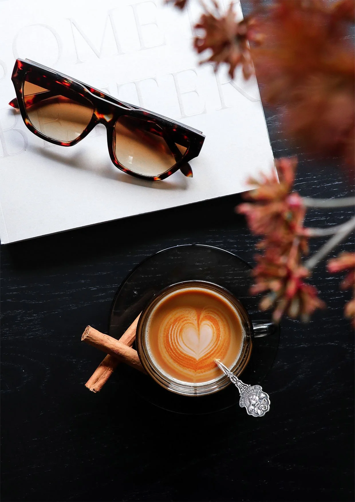
Residence
For Residence, I created a photography series showcasing two coffee moments: one with a more old-fashioned touch and the other with a modern vibe. The old-fashioned photo stands out with its rich, harmonious colors, while the modern one shines with its clean and stylish design.
WOTH
I created two different layouts for the shopping list, using the same products in both. Each layout fits the theme perfectly: one is more playful, while the other is sleeker, yet both blend harmoniously.
WOTH
I created a photo for a special drink, featuring pomegranate as the main ingredient, which is
why the bold pomegranate is prominently
featured in the image. WOTH is known for
its daring content and this photo perfectly
captures that bold energy.
HARPERS BAZAAR

